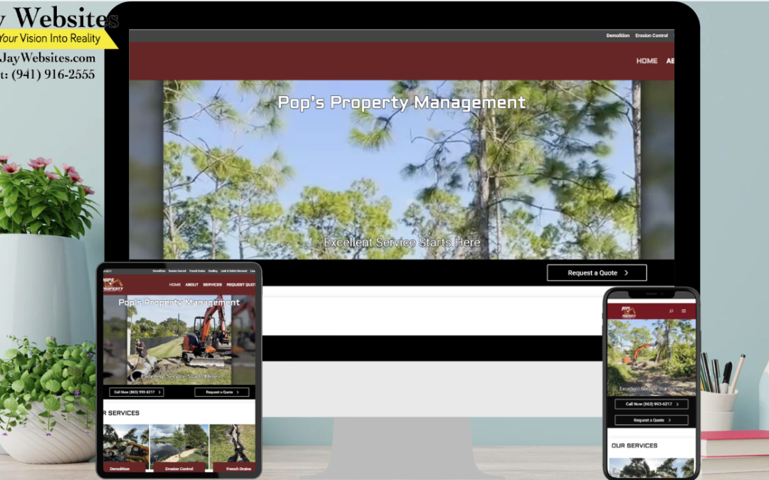
The Pops Property Management website features a clean, service-oriented design that prioritizes clarity and ease of navigation for both property owners and tenants. The layout is straightforward, with clearly defined sections for services, available properties, and contact information. A neutral color palette paired with relevant property imagery helps reinforce professionalism, while concise content blocks make it easy for users to quickly understand offerings such as property management, leasing, and maintenance support.
What makes the site stand out is its focus on simplicity and trust. The messaging is direct and benefit-driven, addressing the needs of both landlords seeking reliable management and tenants looking for quality rentals. Clear calls-to-action guide visitors toward inquiries, applications, or service requests without confusion. By combining an organized layout with practical, user-focused content, the website effectively supports lead generation while building confidence in its services.